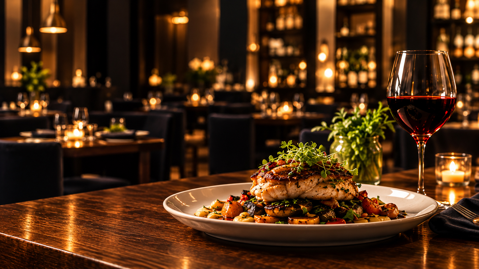
 RESTAURANT
Harbor & Vine ↗Editorial · Cormorant Garamond
RESTAURANT
Harbor & Vine ↗Editorial · Cormorant Garamond
Eight complete demos
Pick a look.
Pick a look.
Open the whole site.
These are not thumbnails. Each one is a full working page with its own typeface pairing, colour system, section structure and conversion path — because a bakery and an accounting firm should not look like the same template with different photos.
Every business, price, address and review inside them is invented. They demonstrate design and structure, not client results.
Meet your website teamTwo brothers.
Two brothers.
One shared standard.
Anthony & Luciano Alfano
We’re building NextDay Digital together. Tell us what your business needs, explore a direction you love, and work directly with us to make it yours.
Let’s build your next chapterChoose a category
The eight themes
Filter by industry, then open a demo. The filter is shareable — send a restaurant owner themes.html?c=food and it opens pre-filtered.
Showing all 8 themes
RESTAURANT
Harbor & Vine ↗Editorial · Cormorant Garamond
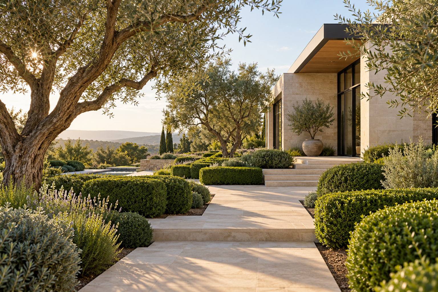 LANDSCAPING
Field & Form ↗Organic · Libre Baskerville
LANDSCAPING
Field & Form ↗Organic · Libre Baskerville
 AUTO DETAILING
Gloss Garage ↗Technical · Bebas Neue
AUTO DETAILING
Gloss Garage ↗Technical · Bebas Neue
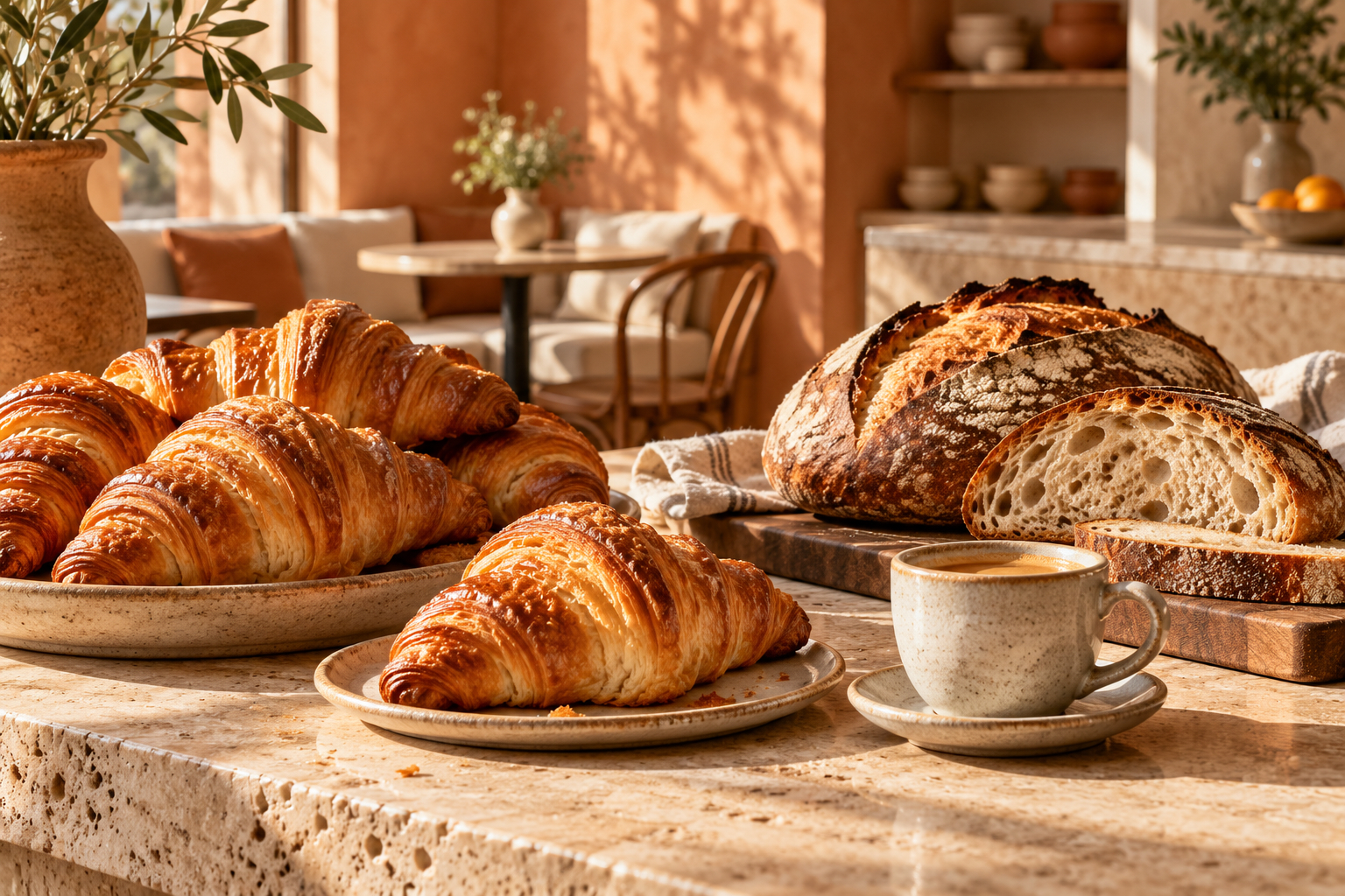 BAKERY & CAF&EACUTE
Sunday Crumb ↗Warm · Fraunces + Caveat
GYM & FITNESS
Northpoint Strength ↗Compressed · Bebas + Barlow Condensed
SALON & SPA
Linden & Co ↗Couture · Cinzel + Cormorant
BAKERY & CAF&EACUTE
Sunday Crumb ↗Warm · Fraunces + Caveat
GYM & FITNESS
Northpoint Strength ↗Compressed · Bebas + Barlow Condensed
SALON & SPA
Linden & Co ↗Couture · Cinzel + Cormorant
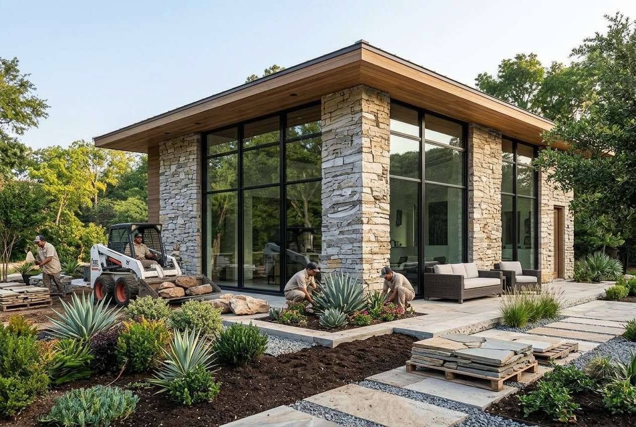 CONTRACTOR
Granite Ridge ↗Structural · Montserrat 900
CONTRACTOR
Granite Ridge ↗Structural · Montserrat 900
 PROFESSIONAL SERVICES
Calloway & Reed ↗Conservative · Merriweather
PROFESSIONAL SERVICES
Calloway & Reed ↗Conservative · Merriweather
Do not see your trade? The structure matters more than the label — the contractor theme suits plumbers, electricians and HVAC just as well as roofers, and the bakery theme works for a florist or a coffee roaster. Tell Anthony & Luciano what you do and we will point you at the closest starting point.
What carries overDifferent look.
Different look.
Same foundation.
The styling changes completely between themes. These do not.
Built into every one
Phone, tablet and desktop
Designed at 390px first, then opened up — not squeezed down afterwards.
A hand-tuned dark mode
Each palette has a second version designed for it, rather than an inverted filter.
Keyboard and screen-reader support
Skip links, visible focus, labelled controls, and a working tab order.
Reduced-motion respect
Reduced-motion preferences are respected, with controls for background video.
Fast on cell data
Lightweight code, lazy-loaded supporting imagery, and no tracking scripts.
Scoped separately
Online payments and carts
Possible, priced on its own, and usually worth delaying until there is demand.
Customer logins
Rarely needed by a small business, and expensive to maintain badly.
Live booking calendars
Connected to a tool you already pay for rather than rebuilt from scratch.
Blogs and content libraries
Worth it only if somebody is genuinely going to write.
Automation
Form routing, reminders, spreadsheet and CRM handoffs. Checked against your tools first.
None of these are off the table. They are quoted separately so you are not paying for something you may never switch on.
Found one you like?
Name the theme in your message.
Open two or three on your phone, decide which one you would trust if it belonged to a competitor, then tell Anthony & Luciano which it was and what your site needs to do better.